Colour is one of those things that can greatly enhance readability of architectural diagrams. I repeatedly find it isn’t used carefully enough. I’m not referring to ecological and economical consequences, although this is regularly overlooked. I’m referring to colour consistency and semantics and not so much aesthetic appeal.
There may be a perception that if colour is used, more effort and therefore quality is inherently contained within the information being conveyed.
Semantics
In modelling/diagramming techniques, colour is another tool in our toolbox for communicating clearly and this should be the primary use of colour, as opposed to aesthetic appeal.
There is no doubt that having an understanding of art theory and colour relationships would improve the aesthetics of some of the diagrams I’ve seen. There’s no need to be an expert in psychology, or a graphic designer, but it can’t be thrown about like a Jackson Pollok and the audience does need to be understood.

Audience
The cultural perceptions of red between the UK/US and China are starkly different, or the subtle differences of orange and yellow in South America vs how we see them in the UK/US. art theory and the relationships between colours can help .e.g. Primary, secondary and tertiary colours, or their complementary and analogous relationships, etc.
To produce diagrams of semantic and aesthetic appeal, we have to take in to account culture as well as some understanding of culture, fashion, and corporate brand.
In Enterprise and Solutions Architecture there are typically three discrete audiences:
- CxO level stakholders
- Architectural Practice stakeholders
- Project delivery stakeholders
Consistency
The collection of viewpoints that communicate a cohesive set of concerns should use the same colouring strategy throughout and that inherent chosen palette and meaning must be consistent. Peter Coad was the first to publish a software engineering book on the subject [ISBN 013011510X – Java modeling in color with UML] and there have been many articles on the subject since.
It will get tricky when the various viewpoints are considered but the principles should be kept in mind.
Colour Taxonomies
There are several approaches that can be taken that may, on occasion also complement each other. For example:
- Architectural Lifecycle Management states
- New, Impacted/Changed, Decommissioned, etc.
- Mainstream, Containment, Retired, etc.
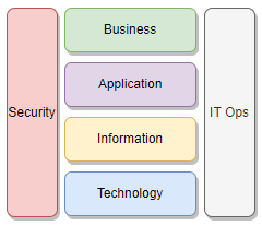
- Enterprise Layers
- Business, Application, Information, Technology, etc.
Colouring Strategy
If an Enterprise brand palette exists, then use it unless it semantically doesn’t work…if semantics are important.
Know your audience: Sometimes we just need to present a pretty picture for CxO stakeholders, or we are dealing with enduring models for the Architecture Practice, as opposed to project delivery modelling.
- CxO stakholders: Aim for corporate brand.
- Architectural Practice: Define Practice branding based on an architectural taxonomy, such as capabilities, or architectural layers. NB These are for enduring models.
- Project Change/Delivery: Aim for cultural analogies .e.g. ALM states and traffic light colours.